Asymmetry in Interior Design: Is It Messy or Innovative?

People design and renovate their homes for several reasons. While none will deny that there’s always the economic benefit of adding more value to your home, we shouldn’t discredit the artistic appeal of treading through the creative process of home design. In fact, once you do away with the numbers and finally have the materials necessary to get the project started, time will pass you by so fast that a weekend off work will feel so minuscule in the grand scheme of things.
However, one problem we have with newbie designers jumping headfirst into one renovation project after the other is the repetition of the same design themes over and over again like modern, contemporary, traditional, and most especially the seemingly ever-present symmetry. Of course, we don’t mean to say that you should just void all forms of balance and harmony in decorating and designing the sunroom, but we think it’s time people learn the beauty behind asymmetrical balance as well.
Table of Contents
What Defines Asymmetrical Balance?
Although the words asymmetry and balance put together may sound contradictory at face value, asymmetrical balance is actually everywhere around us, from the trees and shrubs in the garden to that one angle of a messy workplace that looks just about right. You see, it’s not about placing decorations and furniture haphazardly around the house because there’s still harmony to the entire process, just skewed to what the usual representation of balance may appear.
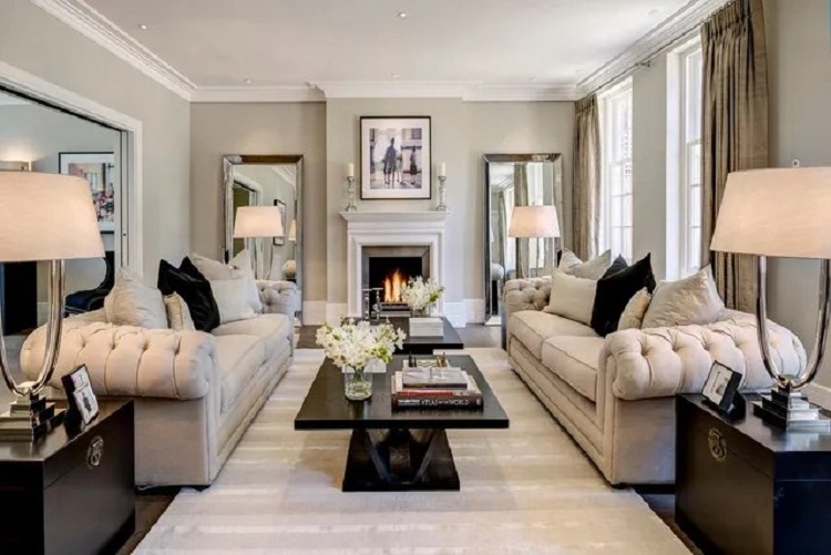
- Doesn’t Rely on Mirror Effects: Firstly, one strict difference between symmetrical and asymmetrical balance is that asymmetry doesn’t rely on mirror effects as the former would usually impose. So instead of getting matching sofas to face each other or balancing out the wall paintings on the left and right sides, you’ll see a lot more dynamic design and visual weight come into play. As a result, there’s a more significant focus on the whole rather than the complements of two or three pieces found in a room.
- Emphasis on a Focal Point: In addition to ditching the visual appeal of mirror effects, asymmetrical balance further pursues the beauty of the whole by emphasizing a focal point to help everything come together. For example, in a radial balanced room, the furniture may not be symmetrical to its adjacent design pieces, but it all falls into place when viewed from the focal point. Yes, the typical appeal of symmetry and balance can achieve the same, but the impact is different.
- Power of Color, Contrast, and Detail: Lastly, one of the cornerstones that define asymmetrical balance is its ability to blend color, contrast, and detail into its advantage due to the eclectic nature of proportion and spacing. Vibrancy helps certain angles pop, detailed crown moldings can exude magnificence, and perception can make small rooms look much bigger than they appear. Of course, this does mean extra work and time are necessary, but the results are worthwhile and like no other.
Where Should a Newbie Start?
While matching contrasting colors, increasing visual interest through uniqueness, and coordinating different elements into a whole sounds easy on paper, visually appealing asymmetrical balance is challenging to master and will require some time and practice. Therefore, we strongly recommend that you work your way up the experience ladder by starting with projects that are simple, affordable, and not that disruptive to your daily schedule.
- Rearranging Your Living Room Furniture: The best way for newbies to start is by rearranging their living room furniture because all the design elements are already present. All they need is a weekend and some motivation to try something new. To begin your asymmetrical balance goal, start by selecting a focal point as your baseline and working your diagonals from there. Afterward, feel free to view the sofas, paintings, rugs, and similar at different angles.
- Quick Bedroom Renovation: Once you’ve graduated from rearranging your living room furniture, we recommend a quick bedroom renovation. For example, you could try placing all the functional items on one side of the room while keeping an odd number of furniture at the opposite end to create a workflow centered around your bed frame. Plus, if you’re feeling extra confident, you can try expanding the room itself or adding new windows to bring more of your imagination to life.
- Overhauling the Kitchen From Scratch: Last but not least, we consider a kitchen overhaul to be among the most difficult asymmetrical balances to pull off. Your best bet would be to embrace an open floor plan to give your more leeway around contrasting design aspects, but it does come at the cost of more expenses and a bigger budget. Furthermore, you’ll also need to worry about the essential home systems, so double-check with your local contractor and plumbing services to discern what’s possible and what’s overstepping your clearance.
Find the Beauty in Asymmetrical Balance
Overall, we think there’s plenty of home design potential in asymmetrical balance that few people know about due to the oversaturated pursuit of normal symmetry. So if you’re looking for something new and unique, be sure to give this design trend a chance on your next renovation project.
Meta title: Creating Asymmetrical Balance Through Interior Design
meta desc: People tend to gravitate toward harmony and balance, but there’s a lot of beauty hidden in asymmetry through interior design as well. Learn how you can create asymmetrical balance in your home design.
Leave a reply
You must be logged in to post a comment.


